Coming to terms with the self-sabotaging beauty of Roma
Much praise has been heaped upon the beautiful cinematography of Alfonso Cuarón’s new film Roma. But that beauty is complicated and even self-sabotaging, explains critic Luke Buckmaster.
Director Alfonso Cuarón’s period piece Roma, set in Mexico during the 1970s and reportedly inspired by his own upbringing, has finally arrived on Netflix after making pit stops at various film festivals before appearing in cinemas for a brief theatrical season. On its long and prestigious journey to our lounge rooms, the film collected from critics the kind of fawning commentary that suggests Cuarón single-handedly invented the very essence of cinematic style, descending from the heavens clutching crisp monochrome tablets of the eye-watering kind never seen hitherto.
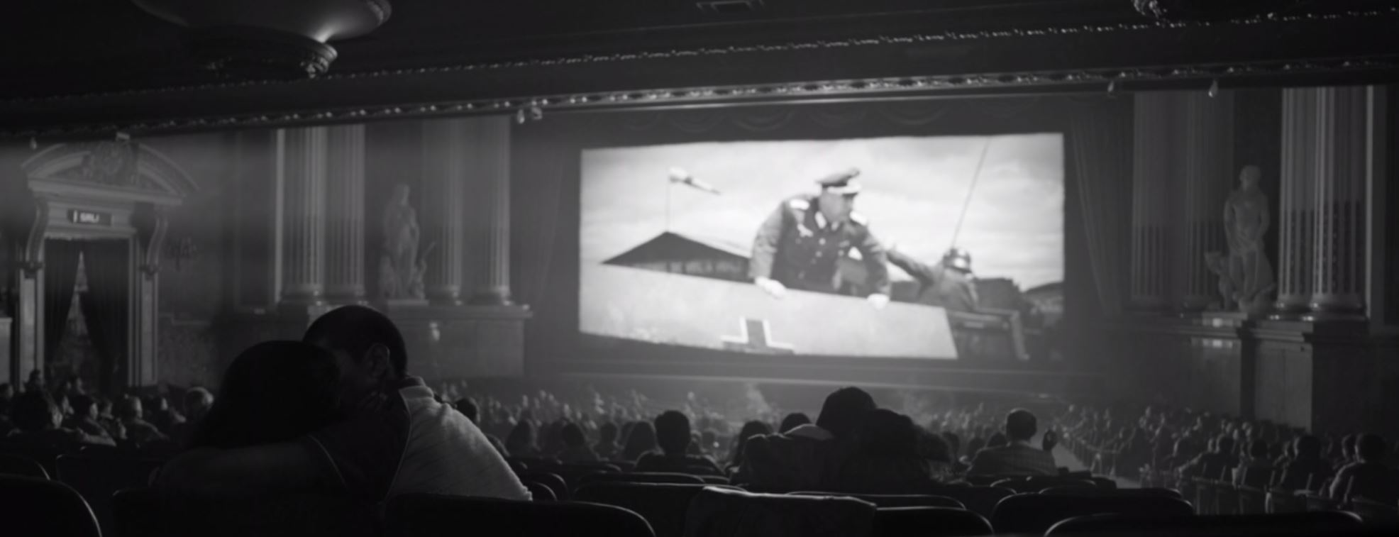
It is certainly a strikingly beautiful piece of work from the very first shot, which uses water being poured over tiles to create an ephemeral state (the image literally washed away within seconds) that plays with cinema’s reflective qualities. Among the reflections in the water is the sight of plane flying high above, which becomes a key motif. Throughout the film Cuarón, performing as his own cinematographer and co-editor, deploys almost nonstop wide shots, stretching his frames on occasions when most directors would consider this unnecessary and distracting.
Instead of venturing inside a parent’s bedroom to focus on a tiff between mum and dad, to use one early example, the director remains outside where he can observe this event only in relation to others: the boy playing on his bed with his football; the nanny Cleo (Yalitza Aparicio) turning off the lights and descending the stairs. This kind of compartmentalised mise en scene, with the ‘focus’ of the frame being the collection of moments within it, tends to be better suited to compositions that create social and cultural analysis (consult Jacques Tati’s 1967 comedy Playtime for a masterclass) rather than, as is the case in Roma, intimate statements.
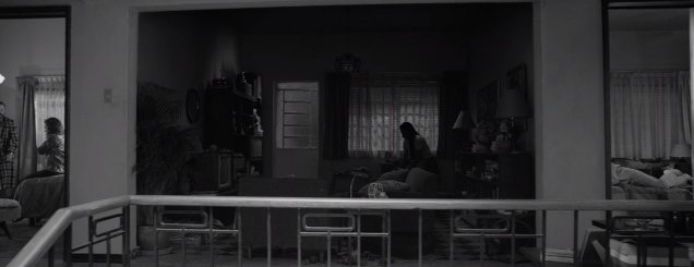
The result is a film that makes big aesthetic observations at the expense of small personal ones, viewing human beings as spatial properties first and foremost; they are things to arrange more than they are people to relate to. Wes Anderson does this a lot also – which is why the words “diorama” and “dollhouse” are often used to describe his work – though his arrangements relish quirky connections, making them feel small and cutesy rather than large and pretentious. Underlying every shot in Roma is a swelling sense of self-importance, which proves a mixed blessing: aesthetically thoughtful while emotionally hollowing.
Every second image (at least) could be tweeted out by One Perfect Shot, such is their painterly nature. The film is full of compositions that are formally impressive but lack the energy that comes with imperfections; the cracks that let the light shine in. At times they are also distancing, calculated to communicate largesse when it is not dramatically warranted.
Consider the following scene, which takes place at a cinema, capturing Cleo and her boyfriend making out then having a deeply personal conversation in the back of the theatre while a film plays in front of them. The scene looks like this:
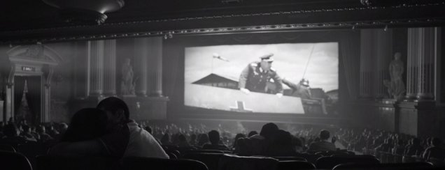
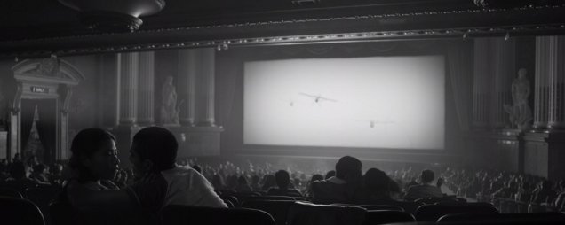
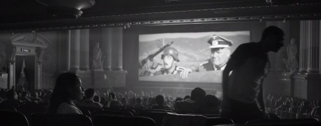
Cuarón’s camera remains behind Cleo’s back, even when her boyfriend exits the frame and leaves her alone with her thoughts. Why? This is a highly significant moment for her; the time she tells him that she thinks she is pregnant. Yet we barely even get a clear impression of her face. The scene has been handsomely rendered but Cleo’s emotions are only a small part of its focus.
In Roma such decisions are the rule and not the exception. I found myself seduced by the film’s look, its beautiful images tumbling around in my mind afterwards. I was also struck by the feeling that the souls of its subjects were someplace else, perhaps in a film that dared to look them in the eye. The monochrome grading seems to take away all kinds of colour – not just aesthetic. Is the director making a point that time capsules are inevitably numb synthetic experiences, incapable of reflecting the vitality of real moments in the here-and-now?
In a constant state of recalling things that are no more and can never be again, Cuarón evokes death much more powerfully than life. I wasn’t surprised, almost an hour into the running time, to see the director cut to an image comprised of cute dogs. Or rather I wasn’t surprised by what had become of them. The dogs are (long) dead, their dismembered heads mounted on a wall.
The artist’s love of style transcends living things; shapes are more important than souls. As a film apparently inspired by his own upbringing, the entire exercise strikes me as strange – like recreating key family moments using figures on loan from Madame Tassauds. While most of us concede that our memories blur and dim with time, Cuarón’s apparently remain cryogenically frozen in spit-polished monochrome, observable through slow moving tracking shots.


